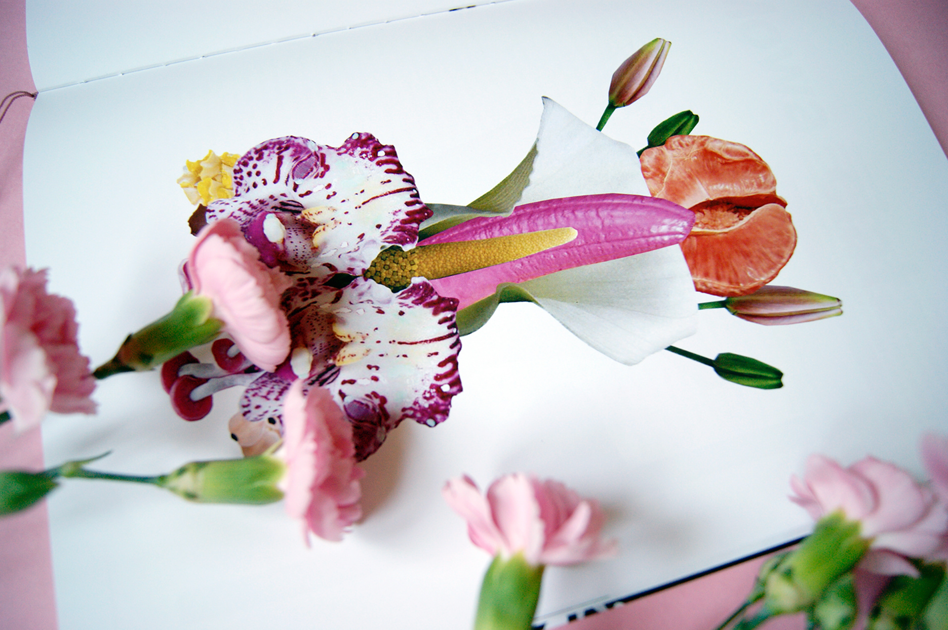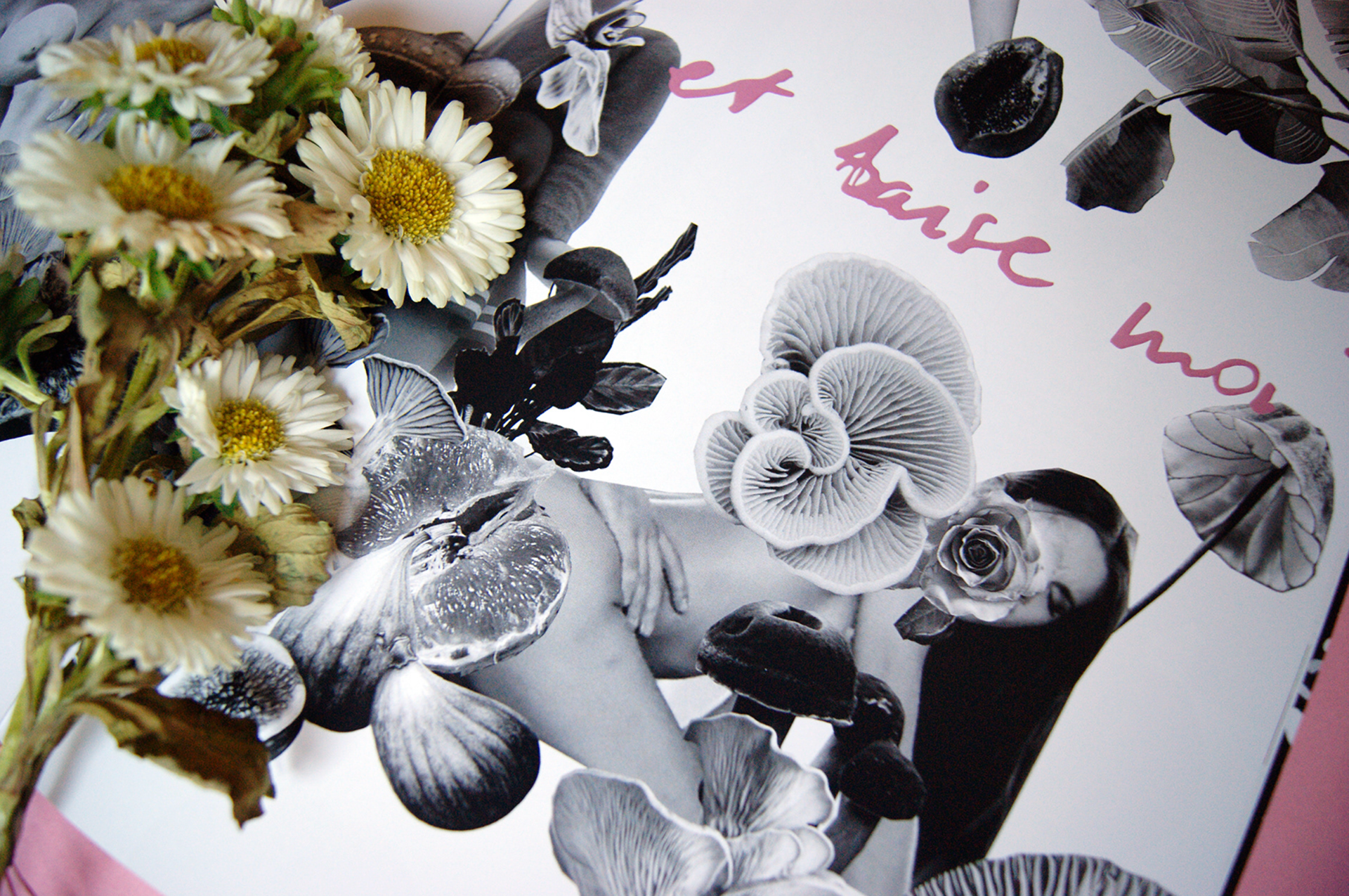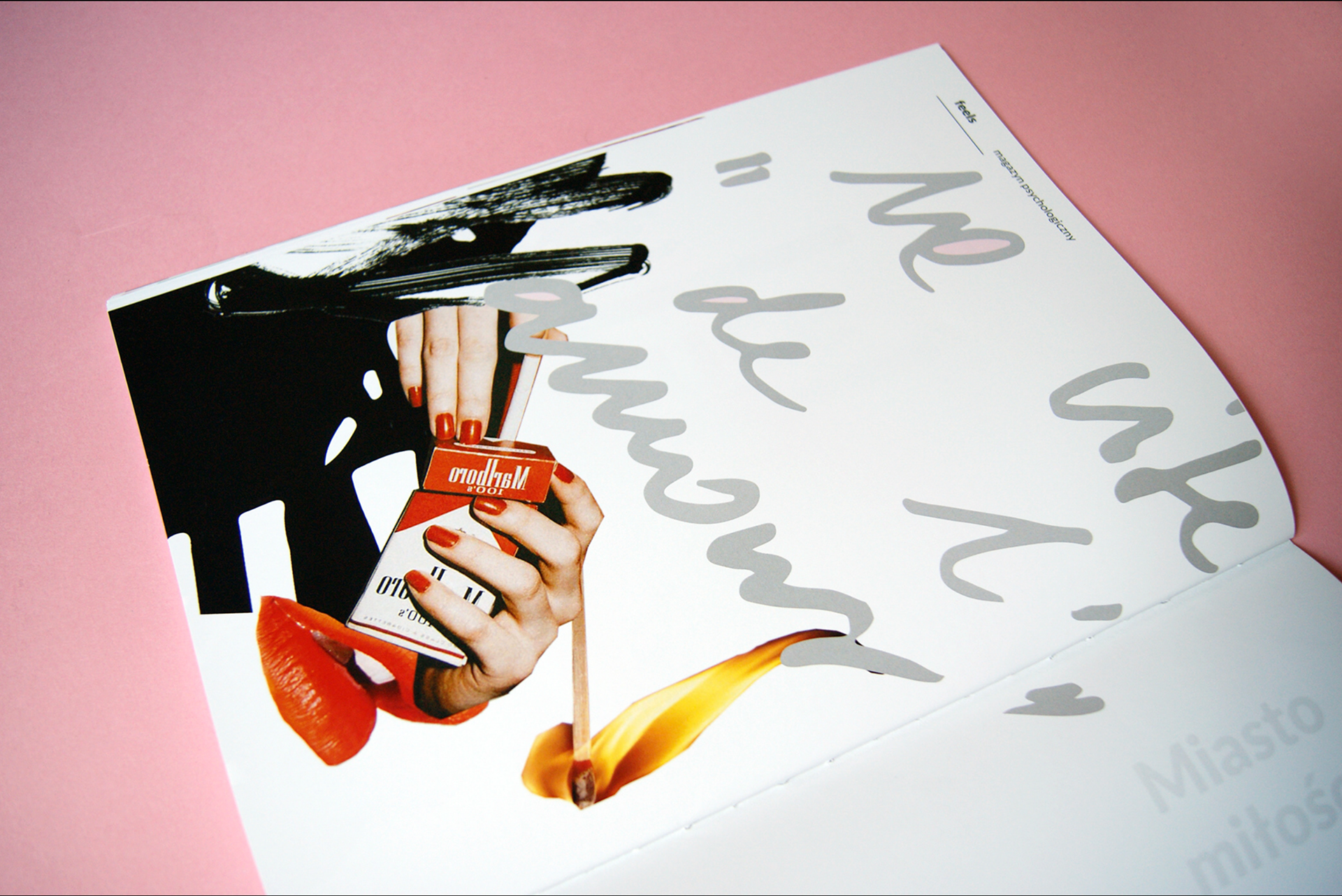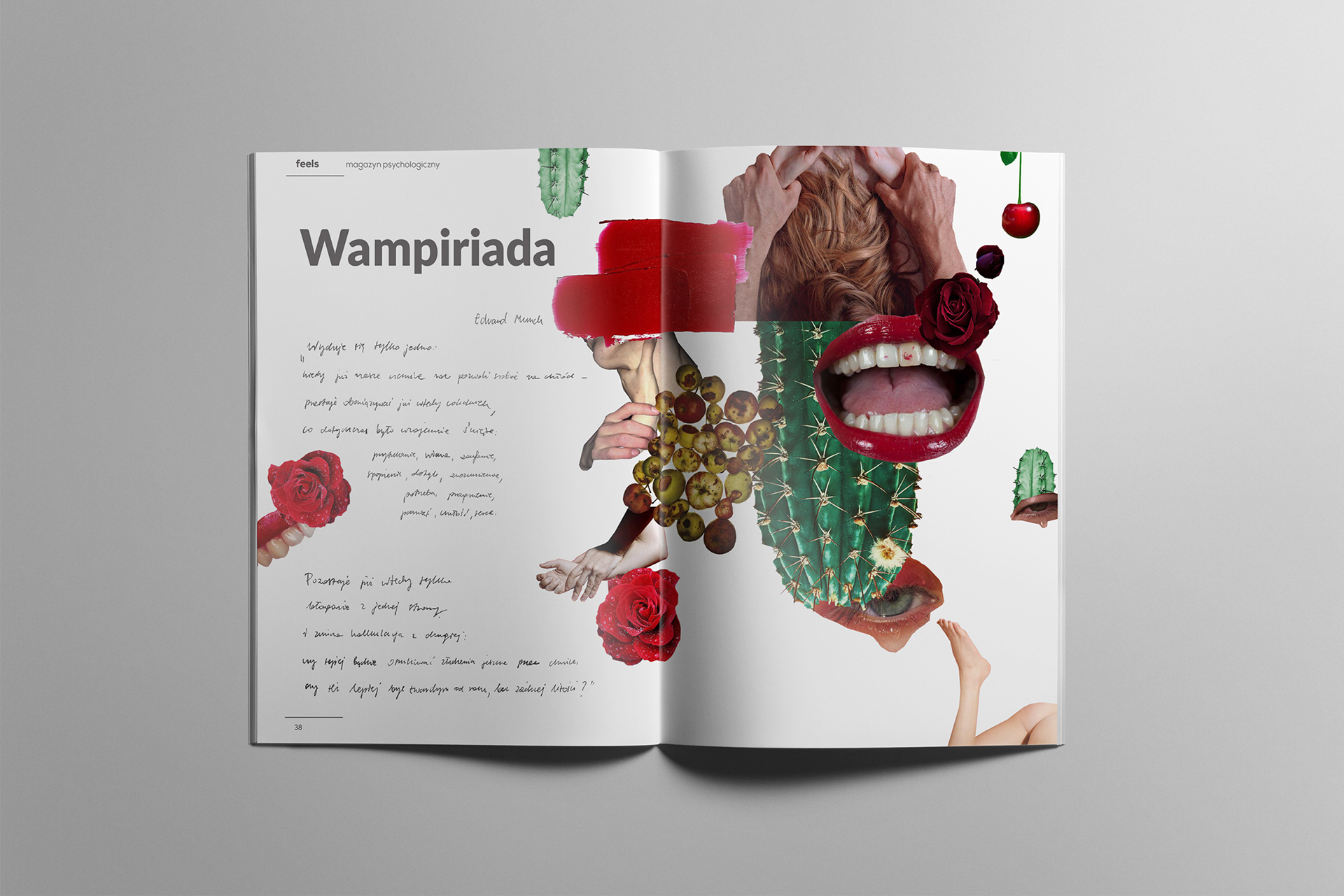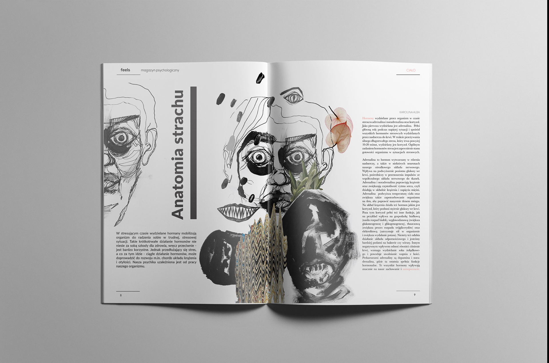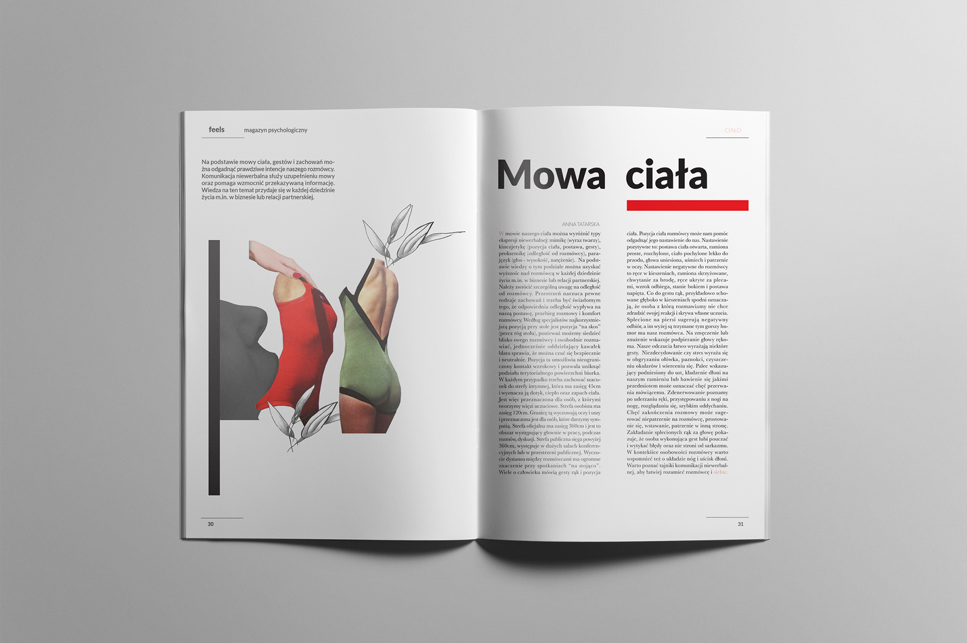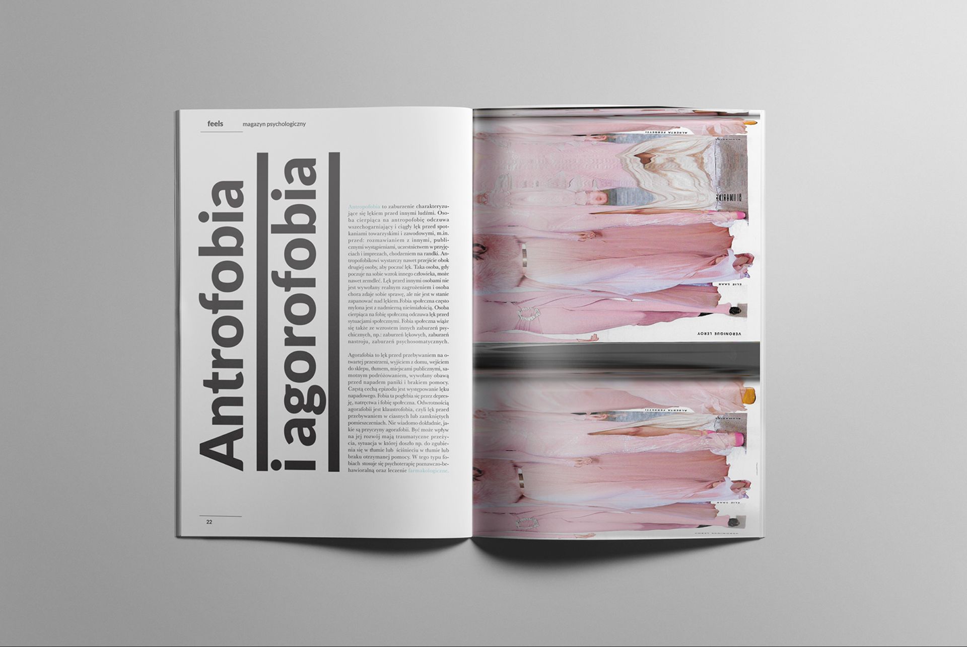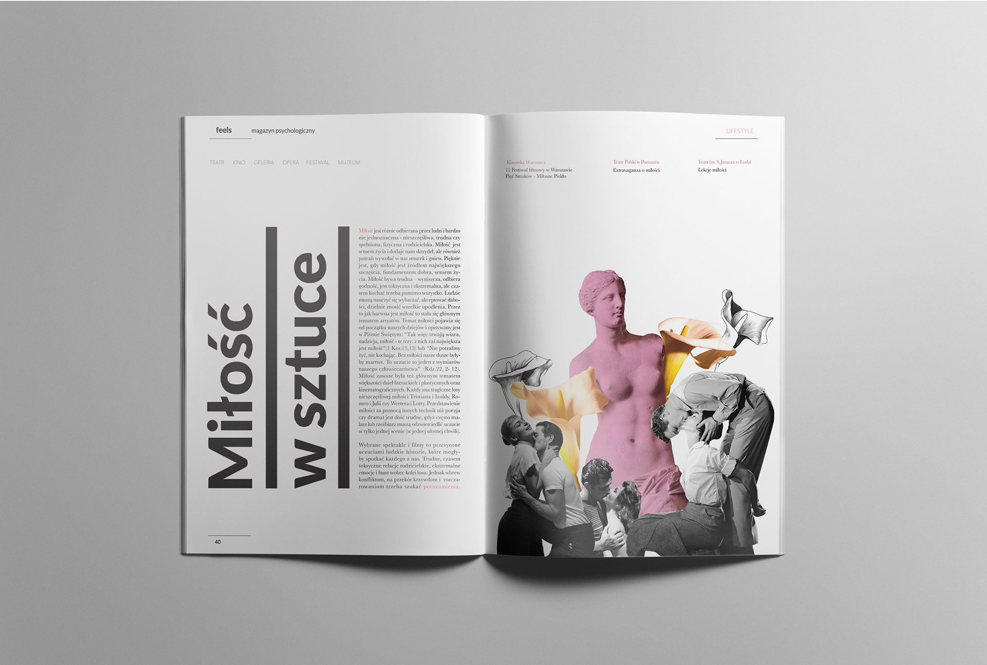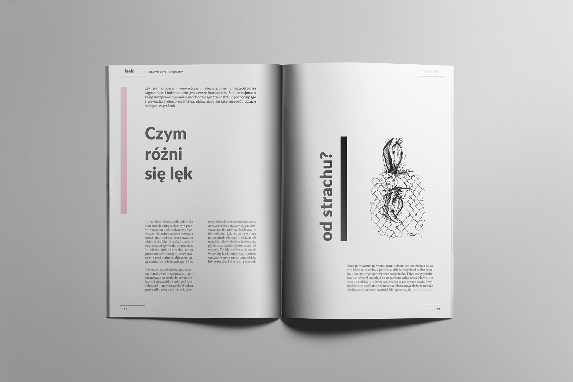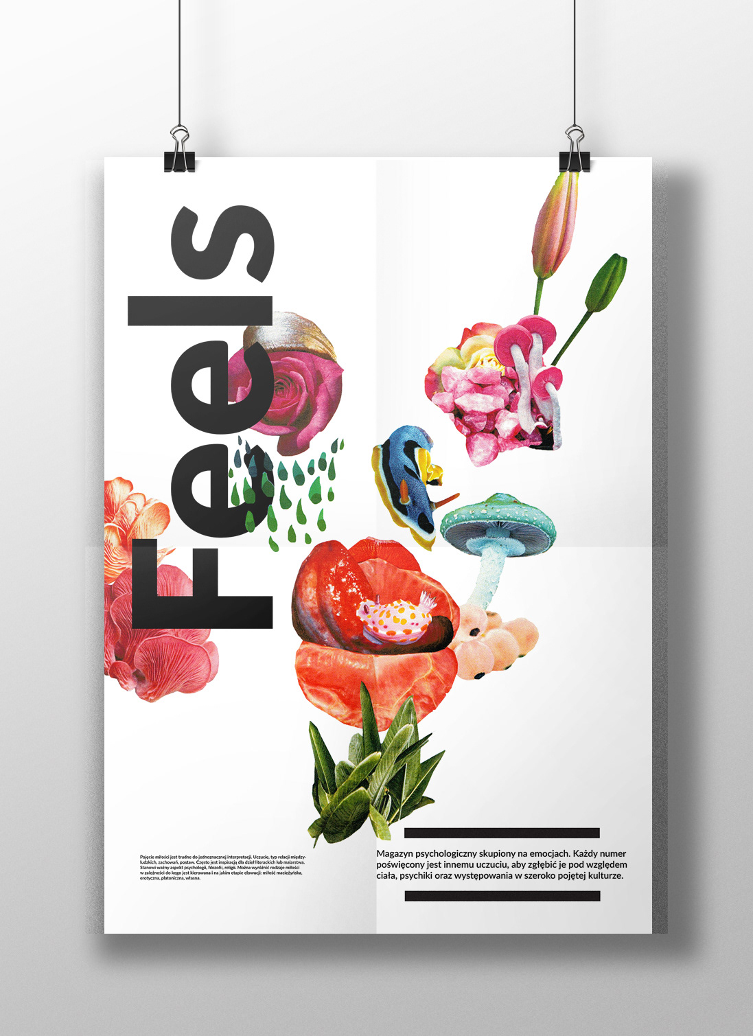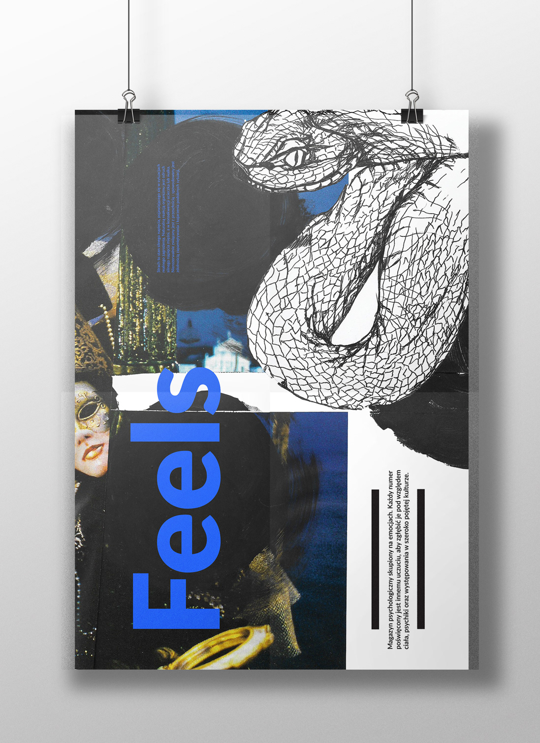
Prezentuję projekt graficzny serii magazynów "Feels" poświęconych tematyce psychologicznej wykonanych w ramach dyplomu na ASP w Łodzi w Pracowni Projektowania Grafiki Wydawniczej i Typografii Mediów Cyfrowych. Projekt obejmuje przygotowanie layoutu, ilustracji i treści serii magazynów oraz serię towarzyszących im plakatów i realizację w wersji drukowanej. Koncept magazynów opiera się na emocjach. Magazyny są luźną formą analizy interesujących zagadnień związanych z wybranym uczuciem, każdy numer to inne uczucie. W pracowni projektowania grafiki wydawniczej i typografii mediów cyfrowych zrealizowałam przykładowe dwa numery, o miłości i strachu. Każdy numer został podzielony na cztery działy, gdzie pierwszy dotyczy sformułowania danego uczucia, następnie interpretacja czucia w kontekście ciała i psychiki ludzkiej oraz występowania w życiu codziennym, szeroko pojętej kulturze. Język wizualny został dopasowany do różniącego się charakteru danego uczucia, ale pozostał „czysty”, współczesny i sensualny. Magazyny zrealizowane zostały w formacie A4 - 29,7 x 21 cm. Jednym z elementów wspomagających budowę layoutu była siatka modularna. Istotne jest też zastosowanie zróżnicowanych środków typograficznych, w zależności od tytułu, cytatu czy bloków tekstowych. Kroje pisma jakie wybrałam to Baskerville i Lato, ze względu na ich budowę, ułatwiającą lekturę. Użyte środki graficzne to kolaż, ilustracja odręczna, połączenie pisma ręcznego ze składem cyfrowym oraz innych działań projektowych i artystycznych. Za atmosferę panującą w danym magazynie odpowiada też dobór kolorystyki.
I am presenting the graphic design of a series of "Feels" magazines devoted to psychological topics, created as part of a diploma at the Academy of Fine Arts in Łódź in the Studio of Publishing Graphic Design and Digital Media Typography. The project includes the preparation of the layout, illustrations and content of a series of magazines, as well as a series of accompanying posters and implementation in a printed version. The concept of magazines is based on emotions. Magazines are a loose form of analysis of interesting issues related to a selected feeling, each issue is a different feeling. In the publishing graphics and digital media typography studio, I created two sample issues about love and fear. Each issue has been divided into four sections, the first of which concerns the formulation of a given feeling, then the interpretation of feeling in the context of the human body and psyche and its occurrence in everyday life and broadly understood culture. The visual language was adapted to the different nature of a given feeling, but remained "pure", contemporary and sensual. The magazines were made in A4 format - 29.7 x 21 cm. One of the elements supporting the construction of the layout was a modular grid. It is also important to use various typographic means, depending on the title, quote or text blocks. The typefaces I chose are Baskerville and Lato because of their structure, which makes reading easier. The graphic means used include collage, hand-drawn illustration, a combination of handwriting and digital typesetting, and other design and artistic activities. The choice of colors is also responsible for the atmosphere in a given warehouse.